Have you ever had professional portraits done and you ordered a great big 8×10 for your wall? You excitedly get home, put it on the wall and it looks like this?
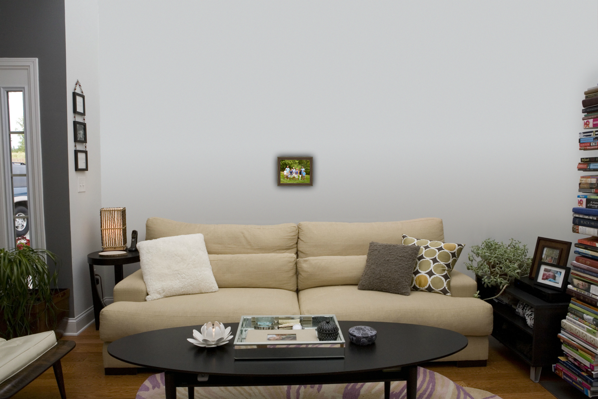
After investing time and money into your portrait session, it can be pretty discouraging to realize that what you thought was a big portrait was really…not. You needed assistance and a way to visualize what your investment would look like in your space. This is the basis of my portrait business. I believe in helping you visualize what will look right in your space!
I’ve invested in software to help clients “see” their portraits on their actual wall BEFORE they order. That’s why when you work with me, we’ll begin by getting some snapshots of any places in your home where you’d consider hanging your portraits. That helps us in a few ways. First of all, we design the portrait session around the rooms where you’d like to display your portraits. If you have red accents in the room, I may recommend including red in the family clothing that is worn. It helps make your artwork look like it belongs in your room.
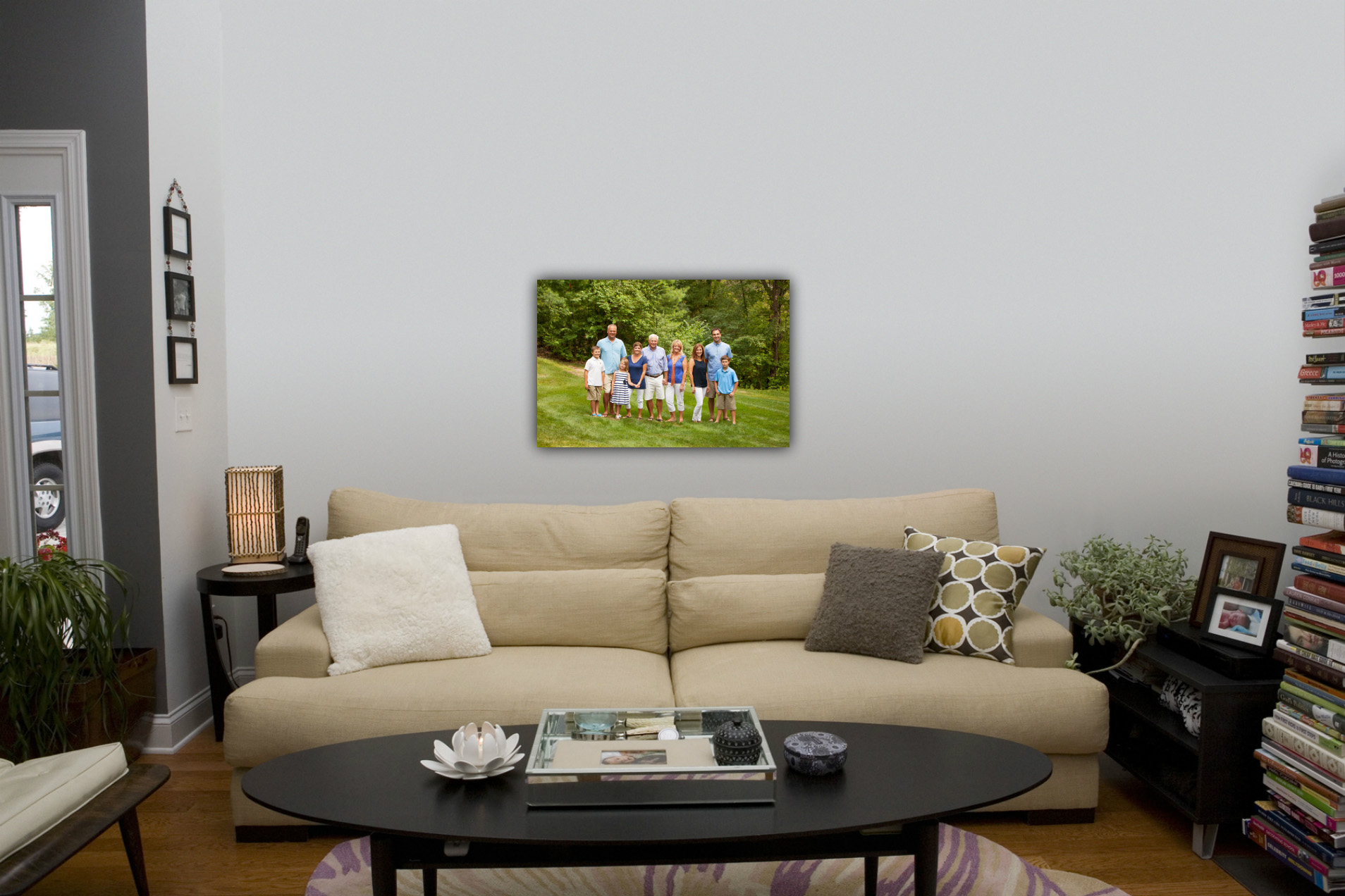
Second, I never want you to be disappointed with the size you select for your portraits. I have heard too many stories of people that wish they’d been guided to order a more appropriate size for their wall. That won’t happen when you work with me. We’ll look at the right sizes, frame choices, and, for wall groupings of multiple images, we’ll play with the arrangements. All before you order.
For the room above, we might have selected a 24×36 canvas for above this sofa. It would have looked something like this:
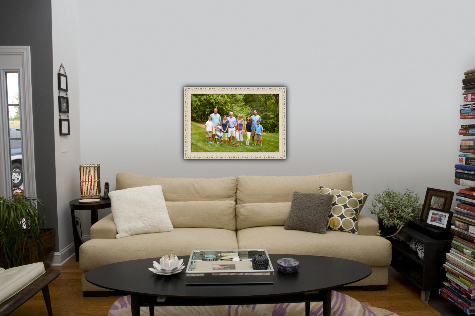
Or, perhaps these clients really love traditional framing and prefer a whitewashed finish. Here is a framed 24×36 that might have worked above their sofa.
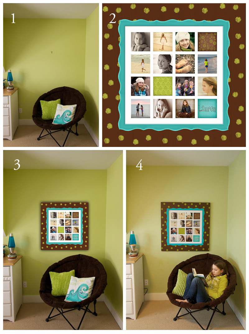
Let me show you a personal project I did for my daughter’s room.
1. Here you can see her room – painted with lime walls, and chocolate and turquoise design elements.
2. I wanted to do a collage of various images of her and I wanted to create a Wild Sorbet frame to match her room [Wild Sorbet was a line of hand painted framing that I offered. Sadly, they have gone out of business]. Here is a copy of the collage in a virtual Wild Sorbet frame that I built using my design software.
3. I played with different sizes for that wall. Once I saw the 24×24 collage on the wall with the frame, I knew that was the right size. This is a virtual image of the artwork on the wall.
4. Finally, you can see the finished framed collage in Lauren’s room. It looks perfect, and I adore looking at it every day. 🙂
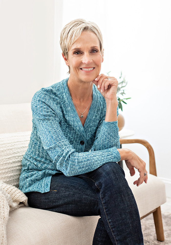
Angie is a brand and headshot photographer serving the Ann Arbor, Brighton + Howell, Michigan area. She works with entrepreneurs to create strategic, personality-driven branding images that elevate their visual brands and attract their dream clients.
In her studio, she also crafts polished headshots for professionals and executives who want to show up with confidence.