


If you know me, you know I’m always studying, researching, certifying and growing in my photography journey. Last year I vowed to become involved in print competitions as a next step in my growth.
I first cut my teeth in my local PPA group by entering low pressure “print of the month” contests. Once I realized I wasn’t going to die of shame or embarrassment, I worked on some images for the group’s Print Competition, a pre-cursor for the International Print Competition through Professional Photographers of America. I also enrolled in a class with a digital artist to learn more about creating merit-worthy images.
At this point, I should explain that a fabulous client image that a mother loves does not necessarily make it a good competition print! Many professional photographers who enter print competitions set up an image in order to massage it and enter it into competition. Other times, at the end of a client session the photographer will take some time to shoot the subject differently for competition purposes. A photographer can take an image, add elements in post processing, digitally paint the image, and/or push and pull the image to create what she has in her mind.
There are twelve elements of a merit image as described by the Professional Photographers of America . These elements include impact, technical excellence, composition, lighting, style, color balance, story telling, subject matter, presentation, creativity, technique and center of interest [read here for more detail]. A merit print must demonstrate all twelve of these elements.
I decided to enter four images at the Northeast District competition and again at the International level. Here is a rundown of the four images I submitted and their outcomes at Districts and IPC:
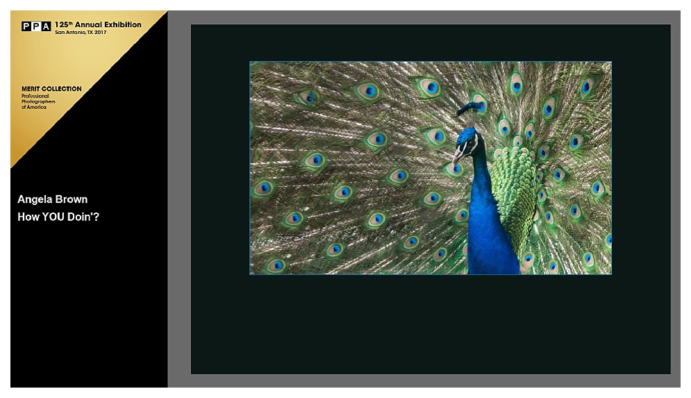
“How YOU Doin’?” was my first merit print! I captured this peacock at the zoo a few years ago and always loved it. He was strutting around the ladies, who of course were ignoring him. 😉 When I began working on this image for competition, I flipped him so he faced left instead of right, cropped in a bit so the eyes of his feathers ended in a pleasing fashion.
He was just screaming for the the title “How YOU Doin’?” because that was Joey Tribbiani’s pick up line in Friends, and just about everyone on the planet knows it. [Titles of an image can make or break its ability to merit.] A digital mat using a blue key line helped the consistency of color. Presentation is also key, and many competition prints get dinged or eliminated due to a bad presentation.
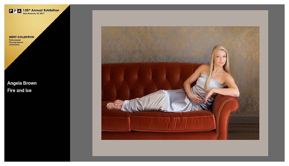
“Fire and Ice” also merited and was probably the image I was most excited about! In fact, this is a concept shoot I set up with a senior client last year during her portrait session. This setting is the office of my good friend and interior designer Kitty Golding. When she got this new sofa and wallpaper, I knew I wanted to use this for a shoot! When I couldn’t find a dress for my vision, I purchased yards of silver satin fabric to go with the iridescent wallpaper. Julia portrayed the subject just like I dreamed.
My other two images came close to a merit but didn’t quite hit the mark. Both scored 79 at districts, which is one point shy of the merit category, and fell short of merits at the IPC [where they only give “merit or no merit”].
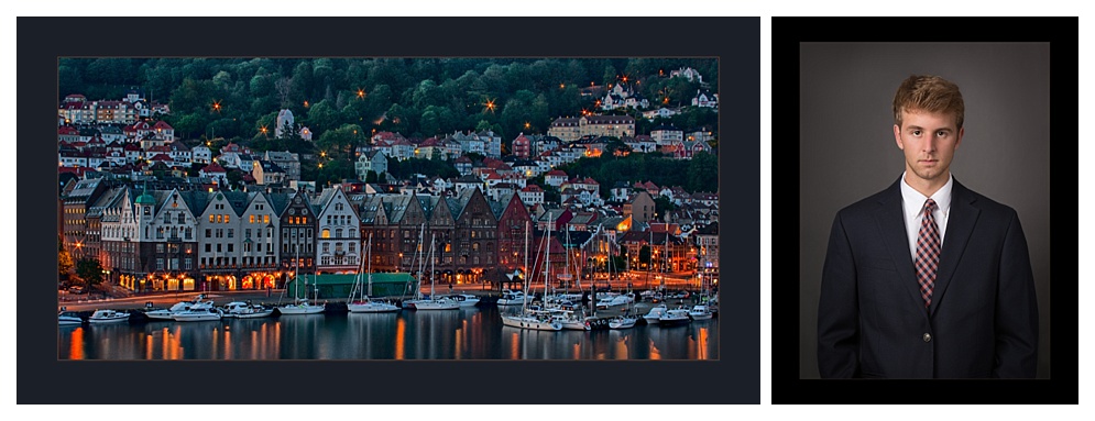
The image on the left is entitled, “A Little Dickens’ Village” and was shot when I was in Bergen, Norway with my mom. I photographed this at midnight from our hotel balcony. Although it was captured in 2009, last year I rediscovered this image and decided to work the image for competition. I had to do a lot of editing and enhancing to help this once-flat image come to life. I never heard good or bad things about the title from judges, but to me, this print looks like the Dickens’ Village I put up every year and decided it was the right name.
The right image is named, “Mom, Make Her Take the Darned Picture!” and also fell just short of a merit. This is an image from one of my senior sessions last year and was taken in my Brighton studio. I tried it cropped in a few different ways but left it wider and in portrait orientation for the competition. I flipped him as well, so this is how he’d see himself in the mirror; I felt the light was better coming in on him from the left. I originally named the print “Sam I Am” after Dr. Seuss’s book because the subject’s name is Sam. The judges in our local competition said the name hurt the image, as it had nothing to do with the story it told. I arrived at the new title because it does tell a story of a senior boy that looks to be impatient with posing.
As I mentioned earlier, sometimes a favorite image for a client isn’t the best print competition image. This particular image of Sam graces his senior album and it’s one of my favorite album cover designs yet!
A goal for next year is to have one of my competition prints “go loan.” This means that the score is over 90 and is the best of the best! The Loan images are forever immortalized by being placed in the prestigious Loan Book. I have a long way to go, but I learned so much watching all the print competitions that I’m ready to move to the next level. I’ve already started thinking about what I want to shoot and letting my creative juices flow!
Angie is a brand and headshot photographer serving the Ann Arbor, Brighton + Howell, Michigan area. She works with entrepreneurs to create strategic, personality-driven branding images that elevate their visual brands and attract their dream clients.
In her studio, she also crafts polished headshots for professionals and executives who want to show up with confidence.

