Your brand colors – you may have chosen them because you love them, but they mean so much more to your business.
Brand colors can invoke a feeling when your clients and followers see it. They also come to expect a certain color (or colors) when they think of you. Wearing your brand colors, both in your brand photos and real life can help people relate to your business.
The palette you use and wear in your business should be something that grows with you – and not something to be changed often! It’s a strategic component of your brand identity. Colors represent the core values and traits of a business’s brand.

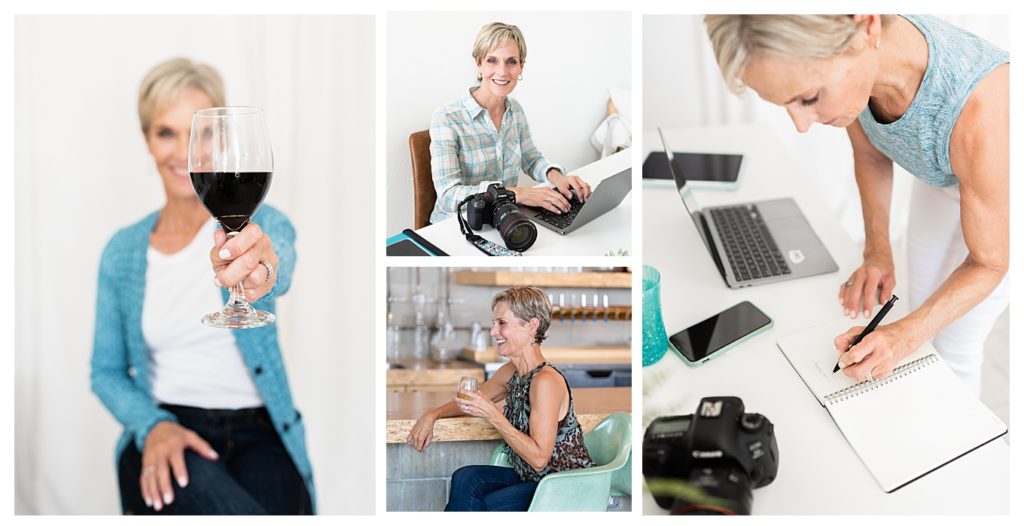
True story: I have had the same two main brand colors since I began my business in 2008! I began with a bright turquoise because I like the color, but I also like the beach, water, summer. Blues in general tend to invoke trust and confidence – values that are important to me and Angela Brown Photography. Digging down further, turquoise blue represents clarity, communication, inspiration – all perfect for brand photography! I believe turquoise is a big part of my brand personality.
My other main color is brown. Even though I love brown, there’s another reason I couldn’t NOT use brown – it’s my last name! 🤣 Brown as a color invokes comfort, reliability, and authenticity. Brown grounds my brand and I want to convey these feelings to my clients when photographing them.
Here are some images from recent branding photo shoots I’ve had done of me. As you can see, my brand colors are hard at work in all the images!

Why Wear Your Brand Colors at Work and in Life?
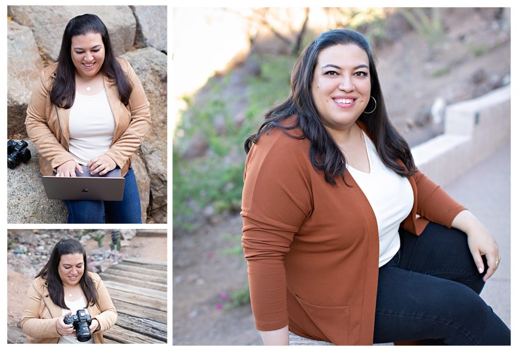
Consider your brand an extension of your personality. If, for example, you are an old soul like Katherine in the images below, your colors are probably muted and neutral. Katherine doesn’t have an over-the-top loud personality and I would have been VERY surprised if she’d wanted to be photographed in bright colors! This photographer and digital designer uses beige, gray and copper on her website and wears them well, too.

Let’s say you’re getting ready to meet with a prospective client who has found you on your website. She’s read your site copy and seen your imagery and other elements. Doesn’t it make sense to be “on brand” with your clothing when you meet her? Being cohesive with your colors helps eliminate brand failure. The client gets a sense of being in the right place when you show up on brand. You’re also apt to be more zoned in and focused when you’re dressed on brand!
Several years ago, I met a web designer in town at her office. For some odd reason, I decided to wear a shirt/cardigan combo that was BRIGHT PURPLE. I honestly don’t know why I even owned an ensemble with those color tones because they just don’t work with my psyche! During that whole meeting, I just felt off. Off brand, off my game. And as it turns out, she didn’t decide to hire me for her brand photos.
When to Change Your Brand Color Palette
As I said earlier, I believe strongly that you shouldn’t change your brand palette often, if at all. However, here are some reasons why modifying your palette makes sense:
- You’ve hired a brand strategist to overhaul your entire brand
- You have changed genres/products and your existing colors feel wrong. An example of this is going from a children’s photographer with bright pinks and blues to a boudoir photographer who now photographs black and white.
- You started your business with the trendy color palette you saw everywhere and now it looks dated and just not you.
- You’ve changed the style of your work (if you are a creative entrepreneur) and the old palette would lead to brand confusion for your customers.
If you make a change in your brand’s color palette, make sure you add a new brand photo shoot into your budget and get that scheduled as soon as your palette is determined!
Are you in need of fresh, on brand images for your business website? I offer strategic personal brand photography sessions in my Brighton Michigan branding studio and surrounding cities. To learn more about my branding services, click here!

Angie is a brand and headshot photographer serving the Ann Arbor, Brighton + Howell, Michigan area. She works with entrepreneurs to create strategic, personality-driven branding images that elevate their visual brands and attract their dream clients.
In her studio, she also crafts polished headshots for professionals and executives who want to show up with confidence.